Fundamentals · Fundamental Graphs
TradingView Fundamental Graphs: Financial Metrics and Company Comparison
Many people watch stocks by staring only at candles and daily percentage moves. Only after price has already moved sharply do they look back at revenue, net income, valuation, and debt. Yet that financial data could have been part of the background from the start.
The value of TradingView Fundamental Graphs is turning dense financial tables into trend charts that are easier to read. It helps you observe how one company changes over time—and put several companies side by side for comparison.
But first, be clear: financial charts are not investment answers.
They help you spot questions faster—then keep asking why.
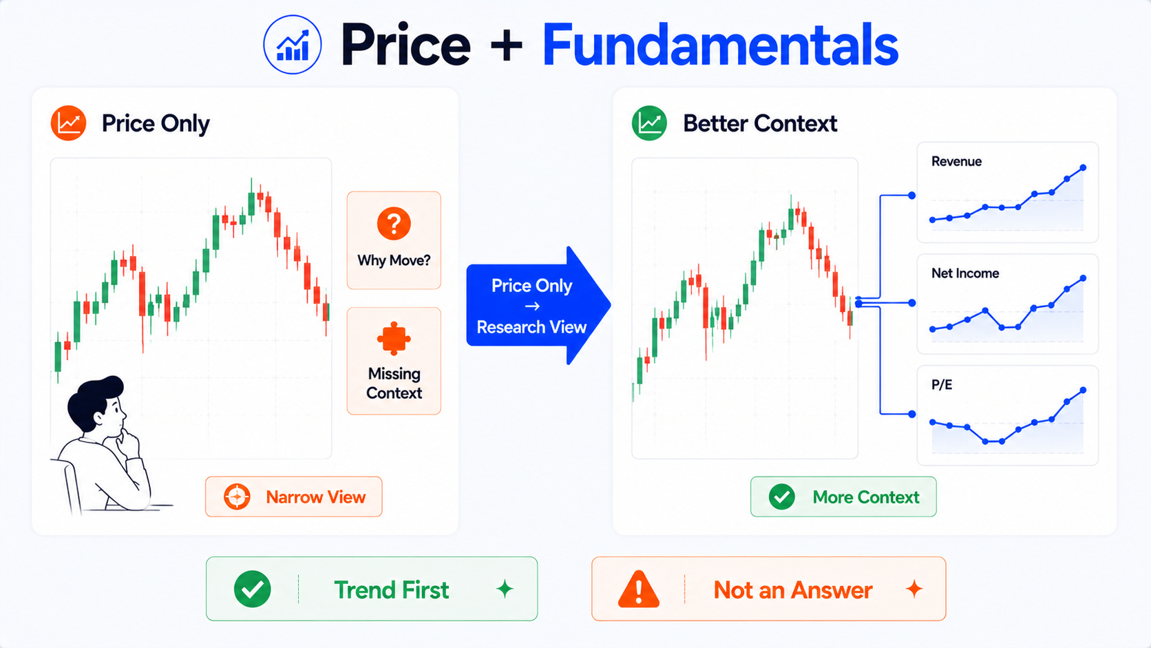
Bottom line first: financial charts are a research entry point, not investment answers
Fundamental Graphs works best for three things:
- Plotting revenue, profit, EPS, valuation, and other metrics as trend charts;
- Observing whether a company's financial metrics improved, deteriorated, or swung widely over recent years;
- Comparing several peer companies to see where differences show up.
It can reduce the blind spot of watching only candles.
But it cannot directly tell you:
- Whether this stock is worth buying;
- That the company will definitely grow in the future;
- That a low P/E always means cheap;
- That revenue growth means the company has no problems;
- That one company is a better investment than its peers;
- That improving metrics will always match rising share price.
The most useful thing about financial charts is not finding one magic metric—it is seeing a bit beyond candles alone.
Beginners should remember:
Look at the trend first, then ask why—that is more reliable than fixating on a single number.
What is TradingView Fundamental Graphs?
TradingView Fundamental Graphs can be understood as a financial metrics visualization tool.
Previously, to read company financials you might open a table full of numbers:
- Total revenue;
- Net income;
- EPS;
- Gross margin;
- ROE;
- P/E;
- Debt to equity;
- Free cash flow;
- Operating margin;
- Dividend yield.
Those numbers are not hard to find in a table—but beginners easily lose the thread: what was this year, what was last year, is the trend up or down, are peers doing better? One row of data rarely gives an immediate feel.
Fundamental Graphs charts those metrics so you can more easily observe:
- Whether a metric grew over the long term;
- Whether growth was steady;
- Which years showed obvious swings;
- Whether profit rose alongside revenue;
- Whether valuation moved with the market;
- Whether gaps between companies widened;
- Whether financial metrics diverged from price action.
It suits watching trends and making comparisons—not drawing buy/sell conclusions at a glance.
What is Fundamental Graphs good for observing?
1. Long-term company changes
For example you can watch:
- Whether revenue grew consistently;
- Whether net income rose with revenue;
- Whether EPS was stable;
- Whether gross margin improved over time;
- Whether ROE stayed at a relatively high level;
- Whether debt levels rose;
- Whether P/E sat in a high or low range.
Once charted, you can see the broad trend without scrolling row by row through a table.
2. Relationships between financial metrics
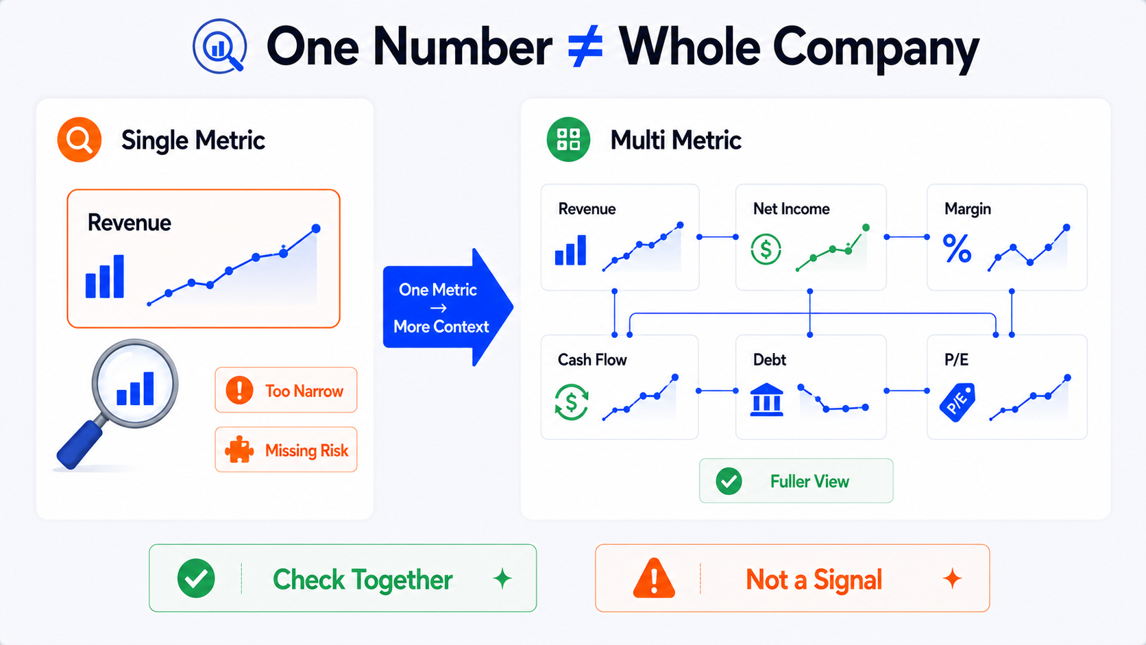
Revenue growth alone can make a company look great.
But if net income did not grow, gross margin fell, or cash flow weakened, the story is more complicated.
Fundamental Graphs helps you view several metrics together:
- Revenue up, but net income flat;
- EPS up, but operating margin down;
- P/E lower, but profit also falling;
- ROE higher, but debt also higher;
- Share price up, but fundamentals not improving in step.
Then you are less likely to be led by a single metric.
3. Peer company comparison
Comparing peers side by side is one of Fundamental Graphs' practical uses.
For example you can compare:
- Revenue growth across several companies;
- P/E levels within an industry;
- Profit margins at different firms;
- EPS growth stability;
- ROE highs and lows;
- Differences in debt levels.
But note: company comparisons work best within the same industry first.
Comparing across industries casually often leads to misleading conclusions.
Financials, Fundamental Graphs, and Stock Screener—what's the difference?
All three tools relate to fundamentals, but they serve different jobs.
| Tool | Best thought of as | Good for | Beginner note |
|---|---|---|---|
| Financials | Financial statements and data detail | Viewing income statement, balance sheet, cash flow, and raw ratios | Good for verifying data sources—do not rely only on summaries |
| Fundamental Graphs | Financial metric trend charts | Charting metrics to observe trends and company comparisons | Good for seeing change—not for investment answers |
| Stock Screener | Stock screening table | Filtering companies by financial metrics, valuation, industry, and technical conditions | Good for narrowing research—not a recommendation list |
Think of it this way:
- Stock Screener helps you find a candidate set first;
- Fundamental Graphs helps you chart key metrics as trends;
- Financials helps you return to the tables to verify details.
These three tools work best together—not as a single dependency.
Which financial metrics should beginners start with?
There are many financial metrics. Beginners do not need to watch all of them on day one.
A more reasonable start is a few basic categories.
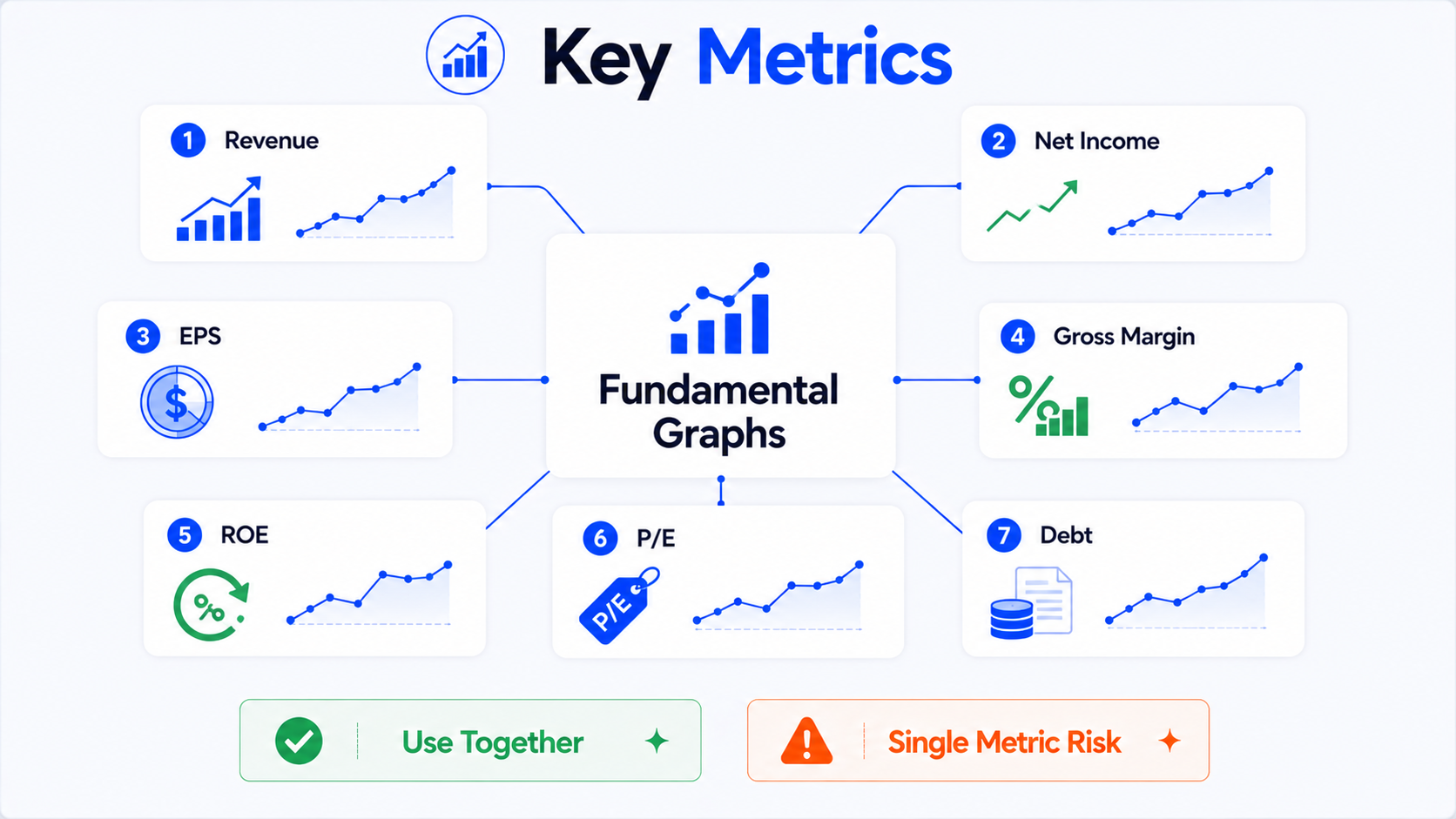
| Metric | Main focus | Common beginner misunderstanding | Why combine with other metrics |
|---|---|---|---|
| Revenue | Whether sales scale is growing | Revenue up always means good | Check profit margin, costs, and cash flow |
| Net income | Final profit result | High net income always means healthy | One-time gains or accounting effects may apply |
| EPS | Profit per share | EPS up always means stronger business | Watch buybacks, share count, and profit quality |
| Gross margin | Profit space on products or services | Higher gross margin always better | Margins differ sharply by industry |
| ROE | Return efficiency on shareholder equity | High ROE always excellent | High debt can also push ROE up |
| P/E | How much the market pays for earnings | Low P/E always cheap | Low valuation may reflect slower growth or risk |
| Debt metrics | Financial leverage and repayment pressure | Debt always bad | Depends on industry, cash flow, and rate environment |
Below is a plain-language explanation of each.
Revenue: first see whether the company is getting bigger
Revenue reflects the income a company earns from selling products or services.
What to look for
When watching revenue, beginners can start with:
- Long-term growth;
- Whether growth was steady;
- Obvious declines;
- Whether growth slowed;
- Whether recent quarters differ from the past trend.
Revenue growth usually means sales scale expanded—but that is only the first layer.
What beginners often misunderstand
The most common mistake:
Revenue up means the company is definitely good.
Not necessarily.
Revenue can rise because of:
- Higher product volume;
- Price increases;
- Revenue from acquisitions;
- Currency effects;
- Short-term demand;
- Expansion in low-margin business.
If costs rose quickly while net income and cash flow did not improve, quality may not have improved.
Why combine with other metrics
Watch revenue alongside:
- Gross margin;
- Net income;
- Operating cash flow;
- Operating margin;
- Expense changes;
- Industry cycle.
Revenue is a starting point—not a conclusion.
Net income: see how much was ultimately earned—but do not stop there
Net income is profit after costs, expenses, taxes, and similar items.
What to look for
You can watch:
- Whether net income grew;
- How volatile it was;
- Whether losses continued;
- Whether net income moved with revenue;
- Whether one year changed sharply.
If revenue rose but net income fell, ask: did costs rise? Did expenses increase? Was there a one-time loss?
What beginners often misunderstand
Many people think:
High net income means no problems.
Not necessarily.
Net income can be affected by one-time gains, asset sales, impairments, tax changes, and accounting treatment. One strong profit year does not always mean core business improved for the long term.
Why combine with other metrics
Net income works best with:
- Operating cash flow;
- Gross margin;
- Operating margin;
- One-time items;
- EPS;
- Debt changes.
Net income alone can hide profit quality.
EPS: profit per share—with attention to share count
EPS is Earnings Per Share.
What to look for
EPS helps you observe:
- Whether earnings per share grew;
- Whether growth was steady;
- Whether losses appeared;
- How EPS relates to valuation;
- Whether EPS growth matched net income.
What beginners often misunderstand
A common mistake:
EPS up means operations definitely strengthened.
Not necessarily.
Share buybacks reduce shares outstanding. Even if net income barely moved, EPS can improve.
That is not always bad—but you need to know why EPS changed.
Why combine with other metrics
Combine EPS with:
- Net income;
- Shares outstanding;
- Revenue;
- Cash flow;
- P/E;
- Buyback activity.
EPS matters—but it is not the whole basis for judging company quality.
Gross margin: profit space on products or services
Gross margin shows how much gross profit remains after direct costs.
What to look for
You can observe:
- Whether gross margin was stable;
- Whether it improved year by year;
- Whether it fell clearly;
- How it differs from peers;
- Whether cost or price shifts affected it.
Long-term gross margin improvement may mean stronger pricing, better cost control, or a shift in business mix.
What beginners often misunderstand
A common mistake:
Higher gross margin always means a better company.
Not necessarily.
Gross margins differ enormously by industry. Software, manufacturing, retail, energy, and banks are not comparable on this alone.
Cross-industry gross margin comparisons have limited meaning.
Why combine with other metrics
Combine gross margin with:
- Industry traits;
- Operating margin;
- Net margin;
- Revenue growth;
- Expense ratios;
- Peer companies.
High gross margin is a clue—you still need to see whether it turns into real profit and cash flow.
ROE: how efficiently equity is used
ROE is Return on Equity—often used to measure how well a company turns shareholder equity into profit.
What to look for
You can observe:
- Whether ROE was stable over time;
- Whether it was clearly above peers;
- Whether it changed sharply;
- Whether it matched profit growth;
- Whether high debt pushed it up.
What beginners often misunderstand
A common mistake:
High ROE always means an excellent company.
Not necessarily.
ROE can be high because of strong profitability—or because heavy debt leaves a smaller equity base.
That is why high ROE should be read with debt structure.
Why combine with other metrics
Combine ROE with:
- Debt to equity;
- Net income;
- Profit margin;
- Asset turnover;
- Industry model;
- Cash flow.
ROE is useful—but not without the balance sheet.
P/E: low does not always mean cheap; high does not always mean extreme
P/E is the price-to-earnings ratio.
What to look for
P/E helps you observe:
- The valuation multiple the market assigns to earnings;
- Whether current valuation is high or low versus history;
- Valuation gaps among peers;
- Whether valuation moved with earnings.
What beginners often misunderstand
The most common mistake:
Low P/E is cheap; high P/E is expensive.
That is too simple.
Low P/E can mean:
- The market doubts future growth;
- The company is in a down cycle;
- Earnings may not be sustainable;
- Industry risk is higher;
- Potential company issues exist.
High P/E can mean:
- The market expects faster growth;
- Earnings quality is viewed as strong;
- The company has a perceived moat;
- The industry has more growth room.
That does not make high P/E automatically reasonable—or low P/E unworthy of study. The point is to ask why.
Low P/E does not always mean cheap. Revenue up does not always mean no problems.
Why combine with other metrics
Combine P/E with:
- EPS growth;
- Revenue growth;
- Profit margin;
- Free cash flow;
- Industry average valuation;
- Rate environment;
- Company outlook.
Valuation metrics should never be read alone.
Debt-related metrics: debt is not always bad—but capacity matters
Debt metrics help you observe financial pressure.
Common examples include:
- Total debt;
- Debt to equity;
- Net debt;
- Interest coverage;
- Current ratio;
- Debt to EBITDA.
What to look for
You can observe:
- Whether debt rose quickly;
- Whether debt matches profit;
- Whether cash flow can service debt;
- Whether rate changes affect financing cost;
- Whether debt is above peers.
What beginners often misunderstand
A common mistake:
Debt means a bad company.
Not necessarily.
Some industries are capital intensive—utilities, real estate, telecom, energy—with debt structures very different from asset-light businesses.
But if debt rises fast while profit and cash flow weaken, pay closer attention.
Why combine with other metrics
Combine debt with:
- Cash flow;
- Interest expense;
- EBITDA;
- Industry model;
- Asset quality;
- Rate environment;
- Maturity schedule.
One debt number rarely shows the full risk picture.
| Debt metric | What it helps you see | Beginner note |
|---|---|---|
| Total debt | Overall borrowing level | Compare with assets, cash, and industry norms |
| Debt to equity | Leverage relative to shareholder equity | High leverage can lift ROE—but adds risk |
| Net debt | Debt after cash on hand | Useful when cash balances are large |
| Interest coverage | Ability to pay interest from earnings | Falling coverage can signal pressure |
| Current ratio | Short-term liquidity | Industry working-capital patterns differ |
| Debt to EBITDA | Debt relative to operating earnings power | Common in capital-intensive sectors |
How to use TradingView Fundamental Graphs
Steps may vary slightly by interface version, but the general flow has six parts.
- Open Fundamental Graphs from the Products menu on the TradingView website. After entering, you will see an interface for choosing symbols and metrics.
- Select the symbol you want to study.
Beginners should confirm:
- Whether the exchange is correct;
- Whether you picked the right company among similar names;
- Whether you selected the intended market;
- Whether reporting currency and basis are clear.
Different listings, ADRs, or exchange codes for the same company can differ in data basis and trading environment.
- Choose the financial metric you want to view—for example:
- Revenue;
- Net income;
- EPS;
- Gross margin;
- ROE;
- P/E;
- Free cash flow;
- Debt to equity.
Do not select too many at once.
Start with one or two metrics for the trend, then add gradually.
If nine metrics crowd one chart, beginners often struggle to read it.
- Adjust time range and display—for example:
- Annual or quarterly data;
- Time range;
- Chart scale;
- Whether to overlay price;
- Whether to compare multiple symbols;
- Whether to compare multiple metrics.
Long-term trends often suit annual data.
Recent shifts or inflection points can be paired with quarterly data.
- Add company comparisons if you want peer context—for example:
- Revenue growth within an industry;
- Gross margin among peers;
- P/E differences;
- ROE stability;
- Debt levels;
- EPS changes.
Do not force companies with very different business models into one comparison.
- Return to Financials to verify.
Charts are an entry point.
When a metric moves sharply, do not conclude from the chart alone.
Go back to Financials, filings, announcements, or official reports to check why.
Especially when you see:
- Profit jumping suddenly;
- EPS changing abruptly;
- Debt rising sharply;
- Gross margin falling quickly;
- P/E dropping suddenly;
- Cash flow diverging from profit.
Charts help you spot anomalies; reports help you understand causes.
What to watch when comparing companies
1. Same industry comparisons work better
Start comparisons within the same industry.
For example:
- Software with software;
- Banks with banks;
- Energy with energy;
- Semiconductors with semiconductors;
- Retail with retail.
Financial structures differ too much across industries.
Comparing a bank's valuation metrics to a tech company often has limited meaning.
2. Data basis can differ by country
Accounting standards, disclosure frequency, tax rules, and industry regulation can differ by country or region.
When comparing across countries, watch for:
- Accounting standard differences;
- Currency differences;
- Reporting period differences;
- Market valuation habits;
- Rate environment;
- Tax and regulatory differences.
The same P/E or ROE label can sit in very different environments.
3. Growth-stage and mature companies are not simple peers
Growth companies may grow revenue fast but with unstable profit; mature companies may grow slowly but with steadier cash flow.
One metric alone can mislead.
For example:
- High P/E at a growth company does not instantly prove it is extreme;
- Low P/E at a mature company does not automatically mean cheap;
- Losses at a high-growth company may be investment phase—or a business model problem;
- Slow growth at a high-dividend company may fit its stage.
4. Cyclical industries swing more
Financial metrics in cyclical industries can move sharply with the economic cycle.
For example:
- Energy;
- Raw materials;
- Shipping;
- Automotive;
- Real estate;
- Semiconductor cycles;
- Industrial manufacturing.
One year of very high profit does not permanently raise long-term earning power; one weak year does not always mean the company is ruined.
Cyclical industries need longer time horizons.
Common beginner mistakes
Mistake 1: Assuming revenue up means the company is definitely good
Revenue growth is a useful clue—not a final verdict.
If growth came from low-margin business, acquisitions, or short-term demand while margins and cash flow did not improve, quality may not have risen.
Mistake 2: Treating low P/E as automatically cheap
Low P/E can be opportunity—or risk pricing.
Keep asking:
- Is profit falling?
- Is the industry in a down cycle?
- Is there debt pressure?
- Is the market worried about future growth?
- Did one-time profit inflate EPS?
Mistake 3: Watching net income but not cash flow
Net income is accounting profit; cash flow reflects cash in and out.
If net income looks good but operating cash flow stays weak for a long time, dig deeper.
Mistake 4: Comparing across industries casually
Different business models cannot be compared on one metric alone.
A high-margin software company and a low-margin retailer may differ because of industry structure—not because one is automatically superior.
Mistake 5: Ignoring data lag
Financial data is not live like candles.
Companies usually report quarterly or annually. What you see on a chart may reflect the prior reporting period while price already moved on expectations or new information.
When reading financial charts, note:
- Which quarter the data belongs to;
- Report release date;
- Whether newer announcements exist;
- Whether the market already priced expectations;
- Whether restatements or revisions occurred.
A more reasonable Fundamental Graphs workflow
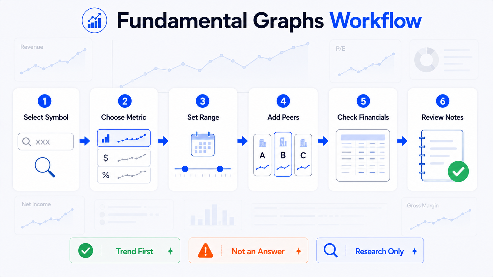
Step 1: Look at the trend first
Do not rush to judge good or bad.
First see whether the metric is:
- Rising;
- Falling;
- Flat;
- Highly volatile;
- Showing a recent inflection;
- Contradicting long-term and short-term patterns.
Step 2: Then look at multiple metrics
Do not rely on one metric.
After revenue growth, also check:
- Net income;
- Gross margin;
- Operating cash flow;
- EPS;
- Debt;
- ROE.
That avoids being seduced by one attractive number.
Step 3: Compare with peers
Place the company among similar firms:
- Is growth more stable?
- Is gross margin higher than peers?
- Is P/E clearly off the group?
- Has ROE led over time?
- Is debt heavier?
- Is cash flow steadier?
Peer comparison helps you tell company-specific traits from industry-wide patterns.
Step 4: Return to Financials to verify
If the chart shows an unusual move, go back to Financials or official company reports.
For example:
- Profit jumped one year;
- Revenue fell sharply one quarter;
- Cash flow turned negative;
- Debt rose quickly;
- P/E changed sharply.
Do not read the shape without the reason.
Step 5: Combine with news and company events
Financial metric changes usually have causes.
They may include:
- New products;
- Acquisitions;
- Cost changes;
- Currency effects;
- Industry cycles;
- Regulatory changes;
- One-time items;
- Management guidance changes;
- Market expectation shifts.
Financial charts help you find questions; news and reports help you understand them.
Step 6: Write a research note
You can record:
- Company studied:
- Exchange / symbol:
- Metrics observed:
- Time range:
- Revenue trend:
- Profit trend:
- Gross margin / ROE:
- Valuation metrics:
- Debt changes:
- Peer comparison set:
- Unusual years:
- Items to verify in Financials:
- Reports or news events:
- Reminder: financial charts are research context only—not buy/sell advice.
Who is Fundamental Graphs for—and who is it not for?
| User type | Suited to Fundamental Graphs? | Why |
|---|---|---|
| Beginners who only watch candles and want fundamental context | Yes | Turns financial metrics into clearer trend charts |
| Users comparing peer companies | Yes | Places several companies' metrics on one chart |
| Long-term company researchers | Yes | Observes multi-year trends and cycles |
| Users looking only for buy/sell signals | No | Financial charts are not trade signals |
| Users unwilling to read filings and announcements | No | Charts are an entry point—details still need verification |
| Users judging stocks on a single metric | No | One metric cannot represent the whole company |
If you are willing to ask a few more questions, it is very useful.
If you want it to hand you answers, it will be misused.
Summary: charting financial metrics improves understanding—it cannot decide for you
The value of TradingView Fundamental Graphs is turning financial metrics from tables into trend charts so beginners can more easily see long-term company change and peer differences.
It can help you see:
- Whether revenue grew;
- Whether net income was stable;
- Whether EPS improved;
- Whether gross margin changed;
- Whether ROE persisted;
- Whether P/E swung;
- Whether debt rose;
- Where peer differences show up.
But it cannot decide whether a stock is good or bad for you—and it is not a basis for buying or selling.
Low P/E does not always mean cheap. Revenue up does not always mean no problems.
Look at the trend first, then ask why—that is more reliable than fixating on one number.
A steadier approach: use Fundamental Graphs for trends, cross-check with multiple metrics, compare peers, then return to Financials, official reports, announcements, news, and risk disclosures to verify causes.
This article covers only the basics of TradingView Fundamental Graphs, fundamental charts, financial metrics, and company comparison. It does not recommend specific stocks, does not give buy/sell advice from any financial metric, and does not promise any returns.
FAQ
What is TradingView Fundamental Graphs?
TradingView Fundamental Graphs is a financial metrics charting tool. It plots company revenue, net income, EPS, P/E, gross margin, ROE, and other metrics as trend charts, and can compare financial metrics across different companies. It works best as an entry point for fundamental research—not as an investment answer.
What is the difference between Fundamental Graphs and Financials?
Financials is more like financial statements and data detail—used to view income statements, balance sheets, cash flow, and ratio figures. Fundamental Graphs is more like a visualization tool that turns those metrics into charts so you can observe trends and comparisons more easily.
Which financial metrics should beginners start with?
Start with revenue, net income, EPS, gross margin, ROE, P/E, and debt-related metrics. No single metric should be used alone—combine them with profit margins, cash flow, industry context, and company reports.
Can you use Fundamental Graphs to compare different companies?
Yes. Fundamental Graphs lets you place multiple companies and metrics on the same chart. Company comparisons work best within the same industry—cross-industry, cross-country, or cross-business-model comparisons can easily mislead.
Can Fundamental Graphs directly tell you whether a stock is worth buying?
No. Financial metric charts help you understand how a company is changing, but they cannot make investment decisions for you. Important information should be cross-checked against official company reports, announcements, risk disclosures, industry background, and your own research goals.